.png)

Shack Shack Singapore's website is on a separate domain from its international site. The UI of the two websites are vastly different. Unfortunately, the Singapore site seems outdated with low resolution images and boxy layouts. Also, majority of the images used reflect Westerners, which I assume are recycled from the headquarters in the U.S. The website lacks content design and a personal touch, which I aim to improve in my version of a site redesign.

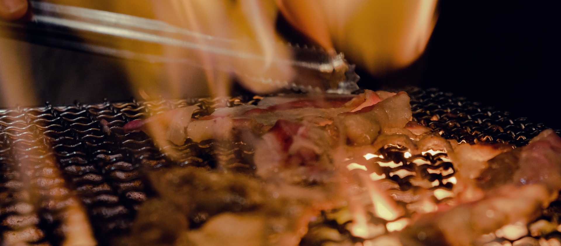
To showcase the huge personality behind the iconic burger brand, I collated a few videos from Shake Shack's YouTube channel and stitched them together using Adobe Premiere Pro. The looped video showcases a fast-paced display of the DNA of every successful business - the people.
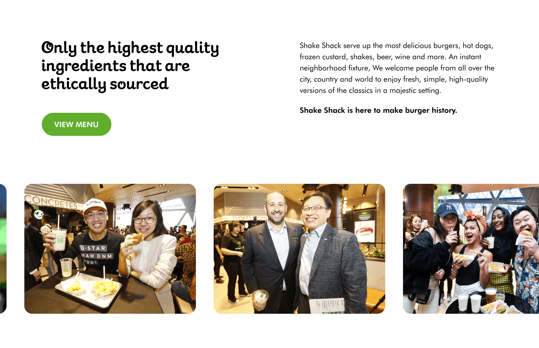
As ShakeShack has a huge number of fans and images available online, I thought it was such a waste that their existing website showcases none of them. So I added a looping marquee of images of happy people enjoying the finest burger in the world.
It was essential that the website showcases a personality that aligns with the brand's welcoming and fun personality. So, I added a (surprising) horizontal scroll effect to showcase the various outlets throughout the nation.

Shake Shack's graphical set is well-known in the design industry and can be seen in outlets around the world. So, why not add it to the website for a little display of quirkiness and fun?


It is true that Shake Shack needs no convincing or introduction. Site visitors likely are looking for location details, wanting to view the menu, or checking for promotional items. I wanted the website to celebrate the people and to highlight the bright brand personality that Shake Shack has, so I incorporated a video on the above-the-fold section of the website as well as a loop marquee featuring images of happy people enjoying the food. All the images used throughout the site are high quality, displaying drool-worthy content.