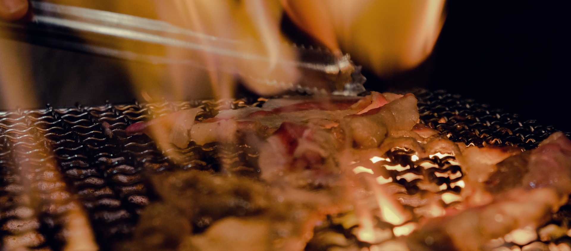
The website of CUT by Wolfgang Puck is a page under the wolfgangpuck.com domain, as is with the rest of Chef Puck's other establishments, products, and services. Based on the site page of CUT alone, I feel that it lacks visual appeal and does not show off the food and beverage offering of the critically acclaimed establishment. My goal is to create a reimagined brand and website for CUT, to boast its beautiful interior, products, and food while still maintaining its fine-dining status.

Brand message: From CUT's interior design and Chef Puck's impressive accolades, it is no doubt that the overall brand message is "sophistication and elegance".
Typography: By analysing the top restaurants in the world, I realised that they commonly use thin sans or sans serif typefaces in their logos with a lot of space and breathing room. So I chose the Canela font, which is is a graceful display typeface, and the Product Sans font - a great font optimized for looking crisp in small text. Disclaimer: the Product Sans font is a property of Google which is unavailable for commercial use.
Colour palette: Sophisticated and elegant brands tend to use a very minimal colour palette, majority sticking to black and white. Hence, I have picked black and white so the images will stand out and tell the story.
.png)
.png)
.png)

I used the Canela font to experiment a few wordmark logo drafts. The part of "BY WOLFGANG PUCK" was challenging to incorporate into the overall logo due to the length of the words individually. My final design broke up those three words into three lines which resembles a downward staircase. Noting that "WOLFGANG" is one word, I intentionally left the second line to read "WOLF" and "G" which indicates that the second line continues on the third line. For the word "CUT", I went with the regular font weight instead of light or bold as it provides the best visual balance on overall.


.png)
.png)
.png)
.png)
Site visitors who would visit CUT's website are likely to already know the restaurant or who Wolfgang Puck is. The objective of the website shall be to wow site visitors, and also for them to access the restaurant's information such as the menu, contact details, and reservations. Inspired by VOGUE magazine covers, the logo is spread across the full width above the fold with a picture of the restaurant's beautiful interior. Paired with ample white space throughout the site, the images play a big part in communicating the brand message to the viewer.