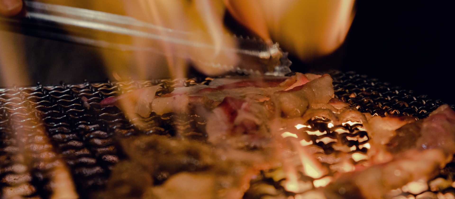
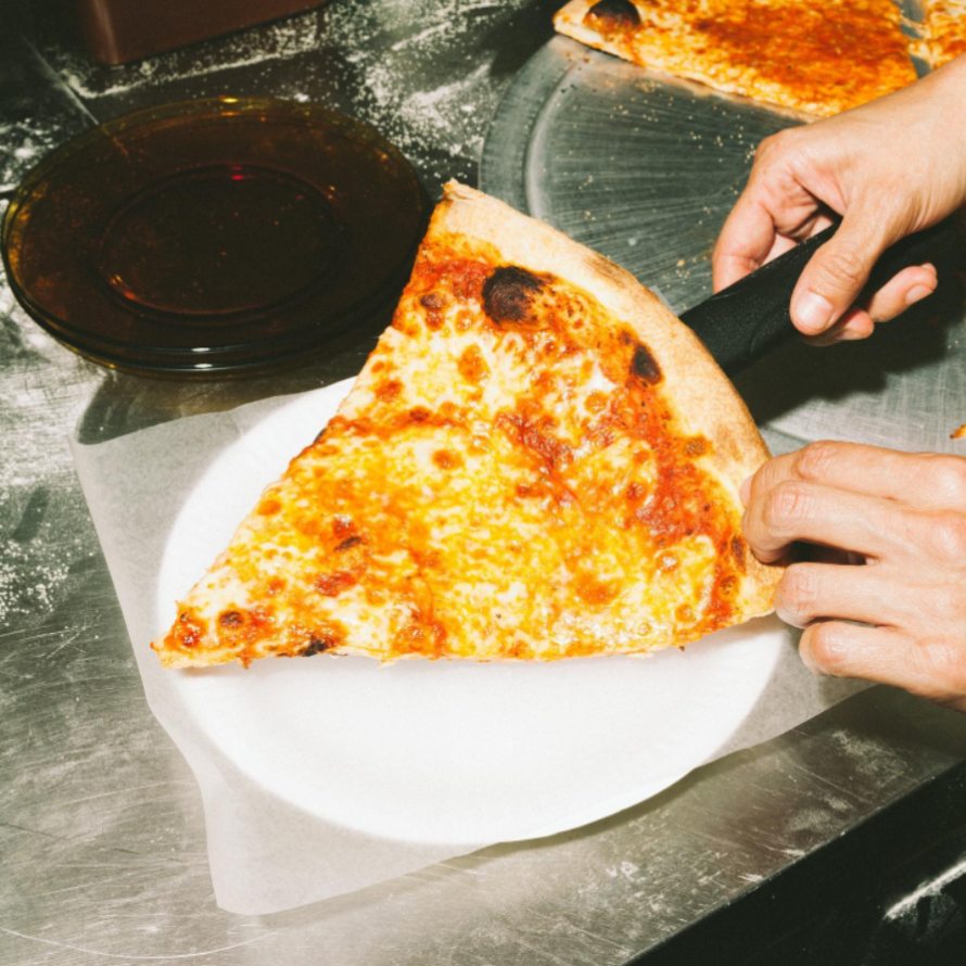
Proper Slice BYGB does not have a website currently. The existing logo is a wordmark that is bold but dull in colour and doesn't do their brand justice. Judging from their social media content, they have a strong personality and character. Plus, they are highly rated and top-ranked for NY-style pizza in Singapore. With a brand identity revamp, Proper Slice BYGB will be able to show its bright and unique personality to the world, as well as leave a lasting impression with a smooth website that stands out from the competition. Ultimately, they should expect more customers and a higher success rate from any digital marketing efforts.

Brand message: After studying Proper Slice BYGB's social media content and captions, I summarized the overall brand message to "old-school hip-hop" which is bold and straight-to-the-point.
Typography: By analysing neighbourhood pizzerias and diners that are in New York, I realised that they commonly use two typefaces (one script and one sans serif or serif) in their logos to give it that signature "old-school" vibe. So I chose the Script MT Bold font, which is unusual and bold, and the Futura font - a classic serif font used for the logos of brands like Supreme and Nike which are brands that heavily influence the hip-hop culture.
Colour palette: Referencing the American flag, the base colours I chose are red, blue, and white. The colour tones were darkened to reflect the "old-school" tone. The main primary colours for the brand are red and white to reflect pepperoni and tomato sauce on bread dough - the classic NY pizza.


With a combination of elements from the logos and icons of various diners and pizzeria, I designed the logo that is a combination mark which makes it versatile and highly unique. I also designed an icon which was a play of the numbers 1-1-0 the street number of Proper Slice BYGB's outlet location. However, it didn't align with the brand "old-school hip-hop". Inspired by Paulie Gee's Slice Shop's icon, I decided to do a loose outline of Proper Slice BYGB's Instagram profile picture - the co-founder taking a bite of the folded pizza while dressed in a suit and tie. The picture reflected personality, swag, and a touch of humour, which perfectly represents the brand's character.

.png)

.png)
.png)
.png)
.png)
Keeping in mind that Proper Slice BYGB's main customers are young adults, content on the website has been kept to a minimum. The section above-the-fold has been reserved to capture attention and leave a lasting impression. The colours, typography, and images are used to communicate to the user throughout the site. I have also included the menu as some surveys show that diners tend to check restaurant websites for menu items before visiting. Lastly, as users scroll to the most bottom of the site, they will be greeted by bright alternating strip graphics. Talk about ending with a bang!